
The techniques used for DYSECO's DYMETRIX Dashboard
What techniques did we use for DYMETRIX and why?
In a previous blog post, I discussed how Dyseco's DYMETRIX dashboard is being used for climate management in high-demand environments such as museums and clean rooms. In this blog post, I want to take a closer look at the underlying techniques we use to process large amounts of data and turn it into useful insights in a responsive dashboard.
React Plotly.js
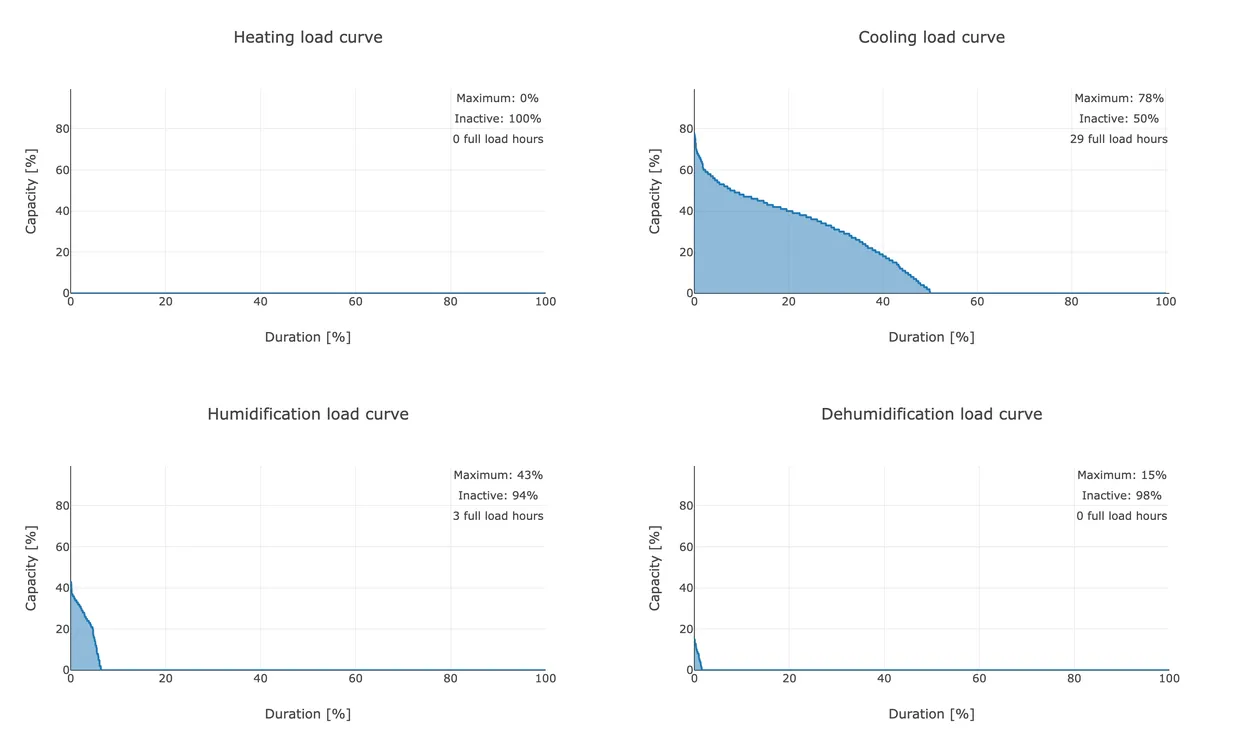
Climate management is a complex field involving many different graphs. Both the climate manager and the DYSECO algorithm developer need to be able to work with various data visualisations to do their jobs properly. To facilitate this, we chose Plotly, a versatile open-source library available in multiple programming languages, including Python and JavaScript. What makes Plotly special is the huge diversity of chart types supported, from simple line and bar charts to more complex 3D plots. This allowed us to cover all our visual needs with one tool.
If we had chosen Plotly Python, the entire page would have to be rendered server-side, requiring users to wait a long time before anything happens. To make the application feel responsive, the page is first loaded with loading icons, after which each graph independently requests data from an API. This ensures that the graphs load one by one, so users don't feel like the application gets stuck.
This is why we choose Plotly in JavaScript, or more specifically, Plotly React. Using Plotly React provides structure to the code that many React developers are already familiar with. This makes it easy to apply reusable components and use React Hooks and state management, for example.
Django API
To retrieve the data from the backend in an asynchronous manner, we built an API using Django and the Django REST Framework. By using Django's strong support for building RESTful APIs, we can set up efficient and well-structured endpoints to send the required data to the frontend. We chose to do as much data processing as possible in the backend with Python, using powerful libraries such as Pandas and NumPy. This approach makes it easy to test the data processing with Pytest, where we focus on testing the business logic. This ensures that we can detect any errors early.
Since the Python backend runs on one machine and the frontend on multiple machines, this approach minimises the risk of problems in the user experience. Moreover, browsers change over time, which can lead to differences in how the frontend is displayed and functions. By properly testing and optimising the backend, we can limit the impact of these changes on the user experience.
Conclusion
By choosing Plotly React for data visualisations and a Django API for efficient data processing, we have created a robust solution. This combination allows us to deliver interactive, responsive dashboards that not only provide valuable insights but are also pleasant to use.

