Focus group research
The next couple of months I will be researching Plone and will try to find weak points in the UI that can be improved in Plone 4.
In this blog post you can find the summary of my interview with Jorrit of youth centre Willemeen, an average Plone user. We discussed things like the amount of buttons and tabs, page editing and the future of Content Management Systems.
Introduction
Hi, my name is Laurens and I work at Four Digits as an intern to complete my study, Communication and Multimedia Design at the HAN in Arnhem. The next couple of months I will be researching Plone and will try to find weak points in the UI that can be improved in Plone 4.
To find these weak points I will contact some users of Plone from the Four Digits clientele and examine Plone with them. In this post you will find a summary of my first interview with a Plone user. You might consider this interesting if you want to know how an average Plone user uses the system and how he feels about it. Combined, you will find some personal statements from my experience with Plone these last couple of weeks. Enjoy.
The guinea pig, Jorrit.
Starting my focus group research, I wanted to meet the users of Plone and observe their ways with the system. I had a try out interview with Jorrit of youth centre Willemeen to work out the best way for these interviews. I am a volunteer at Willemeen and work in Jorrits publicity team. We know each other well and are the only two to work with the Willemeen Plone website. The risk of asking Jorrit for this try out was that we would drift off from the interview and would not be focused on looking at Plone 3. Still starting with a familiar person for my interviews would allow me to make errors and work out some methods for this research, with still having a representative Plone user.
The startup was kind of difficult. Willemeen only has two rooms which have computers and both were packed with people. There was nothing else to do then sit at Jorrits usual desk and don’t mind the rumor. On the other side, Jorrit always works in these conditions, so I joined him in his regular working environment.
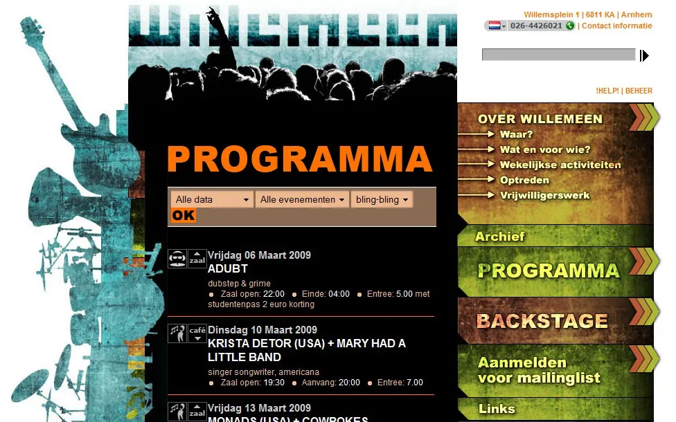
The Willemeen site only lets you do a couple of things, add concerts and events to the agenda, upload pictures to the “backstage” and add news items. Still Jorrits biggest complaint with the system is that it has too many buttons he doesn’t know what to do with. His main task with the system is uploading events to the agenda, news items are rarely posted and he hasn’t started with the use of the backstage yet. So even with only adding pages in folders, Jorrit has trouble working the system.
First let’s find out who Jorrit is before we conclude what creates this struggle. Jorrit works in youth centre Willemeen as head of publicity. This contains being in charge of distributing poster, flyers and press texts, screen-printing and digital publicity. He’s in charge of the website and fully responsible for it. When using his computer he mostly works on gmail, filling in online concert agenda’s and some Photoshop. He spends about two hours a week on Plone, logging in for each minor update. He has no clue what all the buttons of Plone do except the ones he has to use. Even the use of the actions and display drop-downs are unclear to him. Because he has got so accustomed to following his path to adding a page, the system doesn’t slack down his efficiency on the computer. When you ask him to do something else than his regular tasks he has to look thrice at everything, so in unfamiliar territory the system slows him down massively.
What makes Plone so hard to use for Jorrit? Well, Jorrit never had a training in Plone. His predecessor ordered the site long before Jorrit came to Willemeen and never put it online. Jorrit decided to use the site whether he knew how to use it or not, the old one just couldn’t do anymore. So Jorrit got a Plone site without knowing a bit of Plone, the functionality of the site or finances to take a training. No wonder he doesn’t know what most of the buttons do. But is this what we want? That somebody HAS to be trained before he can use Plone? Or do we want to make a system that’s so natural in its use, everyone can use it without effort.
Plone 3
Jorrit really made it clear that Plone didn’t gave him the freedom he wants from a CMS. It has to much functionality he doesn’t use, the system is slow in use (not only is loading a page slow, but you have to load so many pages) and he really feels he is doing what the system desires from him, while the system should do what he wants it to. Jorrit showed me what he did like as an usable system and took out his iPhone. He said that even a guy like him, who doesn’t know much about computers, can still use this. He opened a photo, pressed options, clicked send via e-mail and the picture moved down and up came an editor for e-mail, all seamless and quick. This is what he would want, a focused website which can be used seamlessly and quick. And who can disagree? Focused and seamless were the two most important guidelines when I studied Rich Internet Applications.
To make things even worse he explained why he didn’t like the editor. He said it required him to know HTML and he doesn’t know any. A couple of wrong pastes and enters let you type outside an paragraph and ruin the styling of the site. showing him that he can set styles on the top doesn’t help, he doesn’t want to set styles and headers, he just wants to fill in information about a concert, post a link and an image and be gone with it, he doesn’t want to worry about styles. What can I say, he is right, the editor (kupu or tinyMCE, doesn’t matter) is built for styled page editing, not typing flat text. Even thou Word, Hotmail and a lot of other text editors have a difference in pressing Enter or Shift+Enter, Jorrit didn’t know that and just thinks it’s annoying his texts aren’t aligned similarly. I think this can never be resolved in one editor. Text editor always need some learning curve, otherwise the editor probably cut functionality to make it simple. Making a n00b editor and a l33t one and preferably seamlessly switchable in page editing, could be a solution.
I actually agree with him when he says there are way too many buttons in Plone. The tabs give you the choices Content, View, Edit, Rules, Sharing, History and with a bit of luck the developer installed some products that add extra tabs. And if that wasn’t enough, just beneath all these options you can drop down (!) Actions, Display, Add new and Status. Just opening a page gives me so many things I can do, I don’t know where to start. A thing I personally don’t like in Plone 3 is the Mac-like tabs above the page editor, with the absolutely misplaced ‘default’ naming. Half to my surprise Jorrit had never noticed them before. Is it not that for him the extra metadata fields are not that important, he simply never noticed them. And he confirmed another problem I had with these tabs, he didn’t want to click them because he was afraid of losing his data. These tabs are the only (!) clicks in entire Plone that don’t trigger a refresh. Not refreshing is way good to go, but it’s only these buttons. The user expects leaving the page with a click, because all the other clicks do! When your editing your data your very alert for not losing it, thus no leaving without a save. Consistency is a good way to bring down the learning curve of a system, so this needs to be fixed (making the whole system seamless would be a nice fix).
Future
Although Jorrit has little knowledge about computers and internet applications, he sure knows what he wants them to become in the future. I very much agree with him that a CMS should be workable for people of all sorts and that it should do exactly what you think it would do, so it makes it easy for everyone to use it, even if it’s your first time. A CMS should follow a natural flow, adjust based on the user actions (bending towards the user) and give feed forward whenever possible. In general a CMS should do what it’s intended for, making life easier.
We agreed that internet applications of the future should act and work just like “analog” systems. Sorting your file structure should be as easy as opening a file cabinet (the good examples, in any case) or messing around a stack of paper on your desk. Endlessly clicking and waiting will hopefully be bygones. Current day’s Drag and Drop systems are nice, but will be perfect once we crop the Drop out of it. In the future a CMS would just use Drag. Complete freedom to mess about your content to whatever ways you like. But then, we might want to add an undo button.

